Newsletter

Remodel Update: the Kitchen

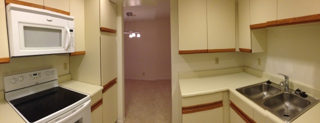
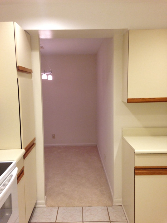
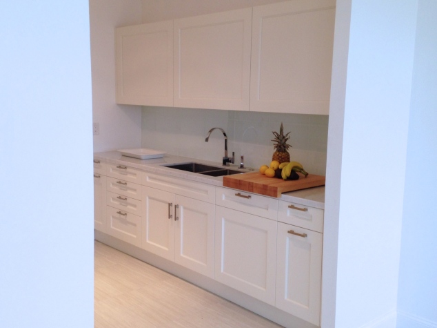
The kitchen came with original cabinetry from 1981…ohhhh vintage? Not really. While the dated look along with small boxed in kitchen seem overwhelming and limiting [seriously why was everything in the 80s’ boxed in with low ceilings?] the transformation was exhilarating. Looking at the before and after you may wonder… is that even the same place????

Before:
%Top Fashion Blogger Chiara%Casiraghi Style

%Top Fashion Blogger Chiara%Casiraghi Style

%Top Fashion Blogger Chiara%Casiraghi Style%Top Fashion Blogger Chiara%Casiraghi Style

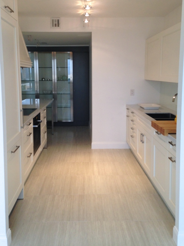
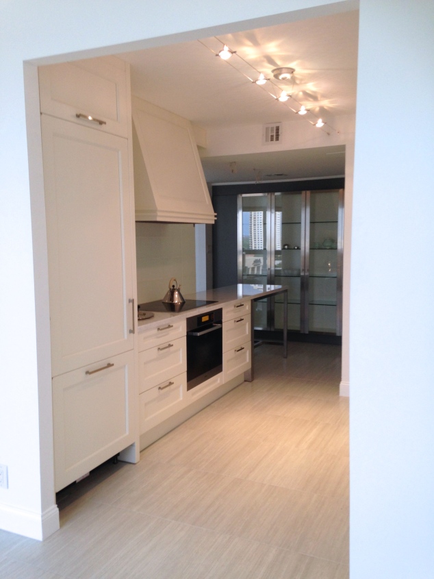
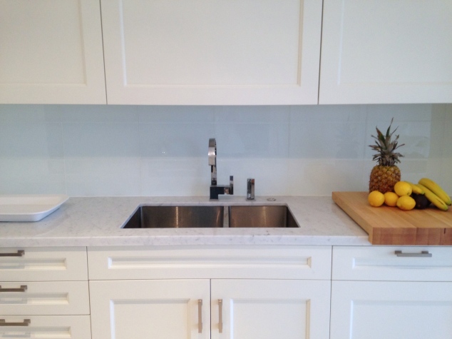
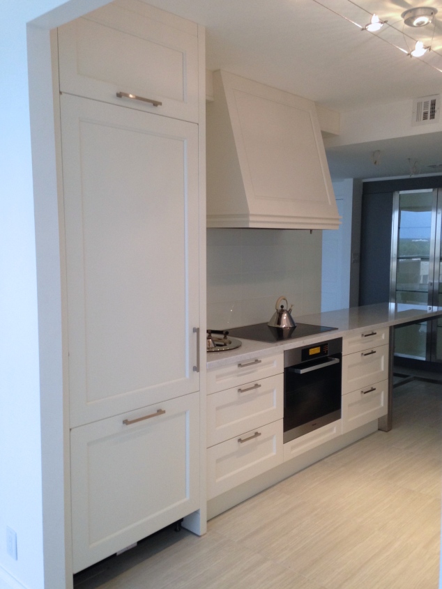
After:
%Top Fashion Blogger Chiara%Casiraghi Style

%Top Fashion Blogger Chiara%Casiraghi Style

%Top Fashion Blogger Chiara%Casiraghi Style

%Top Fashion Blogger Chiara%Casiraghi Style

%Top Fashion Blogger Chiara%Casiraghi Style

Keeping the basic gallery kitchen concept, the ceiling was raised,  the entrance connecting the breakfast nook to the kitchen was opened and the breakfast bar added thus extending the kitchen into the breakfast room with stainless steel cabinetry along the breakfast room wall. This gave more room for storage. Opening the wall dividing the kitchen and the formal dining room made a huge impact. Not only does it add the much needed natural lighting and great Galleria view but opened the space up for easy entertaining, open concept feel without a “open concept” per se.

Cabinetry and design:  Downsview Kitchens | appliances: Miele | pulls: Restoration Hardware strande collection | faucet: Danze | track lighting: Tiella | tray & kettle: Alessi

Follow:
0
Share:

2 Comments

  1. Gianangelo
    July 3, 2014 / 1:50 pm

    Looking forward to see the “Before and After” on the rest of the house. Nice job!!!